Search

Gro Intelligence Digital Crop Tour Guide: National Wrap-up
The Gro Intelligence Digital Crop Tour concludes today with a wrap-up of the 10 states we’ve covered over the past week. In the graphics below, we compare the current corn and soybean yield outlooks between Gro’s Yield Model and the USDA’s model. The tree maps report the yield estimates (in bushels per acre) for each corn and soybean producing state, where each block represents the proportion of total corn and soybean production on a national scale.


The Gro Yield Model’s estimates dipped slightly over the weekend, primarily due to updates with the newest NDVI data, which indicates trends toward reduced vegetative health in key production centers. However, incoming rains, may alleviate the current drought deficit, which would greatly help corn kernel fill and soybean pod development.

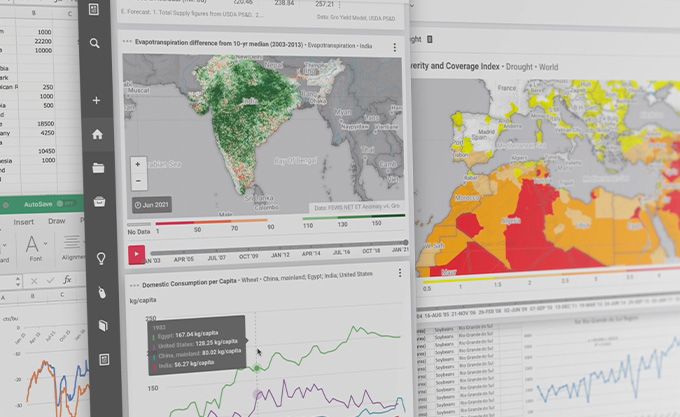
Despite the end of the formal crop tour, Gro Intelligence subscribers can monitor daily changes in our county and state-level yield estimates for corn and soybeans throughout the growing season by using the data available from our yield models.


 Blog
BlogSouth America: Fall Planting Snapshot
 Insight
Soggy Start to Spring Points to Fertilizer Application Delays for US Corn
 Insight
China’s Grain Imports Reach Record With a Growing Reliance on Brazil
 Insight