Search

How to Use Gro’s ‘Combine & Compare’ Feature
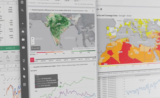
We at Gro are working hard to provide you useful tools to help with your analysis. When creating a new chart, you can select more than one item or region in your data series. You can choose whether to compare the individual values of the selected items and regions on the same chart, or show the aggregated value for all selected entities.
For example, a user analyzing South American production trends may be interested in harvested area for corn and soybeans in Argentina. Selecting corn and soybeans in the add data series panel will produce area measurements for each crop, allowing users to compare them. Alternatively, the harvested areas for both crops can be combined by dragging one item name on top of the other in the add data series panel.
Regions also can be combined or compared in the same way. Consider, for example, an analysis of US wheat exports to major destinations in Africa. A user could compare the exports of US wheat to individual countries, such as Algeria, Egypt, and Morocco. By combining those regions in the add data series panel, however, the aggregate wheat exports from the US to those three countries will be displayed.
Watch the video below to see how the Combine and Compare feature is used.
We hope you will find this feature useful. If you have any feedback on this feature, or have ideas for new ones, please contact us at product@gro-intelligence.com
As part of our vision to make agricultural data accessible to all, we are excited to announce that we have launched a free version of our data platform, Gro! To create your free Gro account click here.
 Blog
BlogSouth America: Fall Planting Snapshot
 Insight
Soggy Start to Spring Points to Fertilizer Application Delays for US Corn
 Insight
Low US Hard Red Winter Wheat Production Likely, Despite Acreage Boost
 Insight